Don't Make These Common Mistakes When Choosing Paint Colour
- Susan Wilson
- May 3, 2020
- 5 min read
How to select paint colours that will look perfect in your home
Home is where the heart is. and the office is. and your kids' school is. and the yoga studio is. and the date night restaurant. and the movie theatre. and your therapist's office. and-
Ok, you get it. We're all spending really a lot of time looking at our own four walls.
And just a teeny bit of time on social media shows me a lot of people are:
a) embarking on projects that have been on their to-do-list for ages and
b) wanting to make their home a nice place to be because, well, see above.
Painting is one of the quickest, easiest and most cost-effective way of giving your home a new look, and if you're gonna do it, I want to help you get it right.
As I said, painting is easy--getting the right colour is often not. So, I thought it would be helpful to give you all some tips on how to choose your paint colours. I bring you:
What Not to Do When Choosing Paint Colours
1. Do not simply select a colour off Pinterest and buy three gallons of it
Just because your favourite tv designer has put a colour on his/her list of 'best whites', 'best greys', 'best magentas' doesn't necessarily mean it's the right colour for you. For sure you can use these lists as a starting point, but you need to test these colours in your own home, in the actual room you're going to use them in. They need to look right with your furniture, your countertops, your fireplace surround, your Bichon Frise.
2. Don't just select a colour straight from a little 1" by 1" square

That colour's gonna look a lot different on a nine by 15 foot wall. Many colours tend to look considerably darker, brighter, more saturated; whatever a colour is, it looks more so when it covers a whole room. You think you're getting this:

But you may end up with this:

When I specify colours for a client, I use my large Maria Killam colour sample boards, which give a much better idea of how the colour will feel, and they allow me to move the sample around so that I can show my client how the colour will work with their sofa, their floor tile, their favourite piece of art etc. It also lets them see clearly what won't work.
You can paint up your own large sample board that you can move around and hold up on different walls, and next to all the elements in a room that the colour's going to need to play nicely with. Colours will also be affected by lighting, so check the colour in all the rooms it will be painted in, at all times of day to get a good feel for how it will really look. Or if you like, you can paint samples directly on the walls, in large sections so you get a good idea of what it will look like when the whole room is done.
Which leads me to my next 'Don't"...
3. Don't judge a colour by how it looks with your existing wall colour

Because that's basically testing how a colour looks next to a colour that won't even be in the space when you're done painting over it, and that's not very helpful. On top of that, judging a colour next to another colour skews our perception of it, so that we're only seeing it in comparison to the old colour. A blue-green can look just plain green next to a very cool blue existing wall colour, but put it next to green and it will look blue. You need to make sure to have a band of plain white around any colour you're looking at, to separate it from the existing wall colour. This will allow your eye to see the true colour more clearly. I place large white boards around my colour boards when specifying colours for clients.

In short, testing how a colour looks next to your sofa: Good. Testing a colour next to the wall colour you're getting rid of: Not ideal.
4. Don't ignore the orientation of the colour you're testing
Paint the colour where it's actually going to be, and if you are using large boards, make sure that you're looking at them at the right angle, as that can affect how the light hits the colour. If you're testing a colour that will be going on the ceiling, hold the colour board high up, horizontally, facing down, next to the new wall colour. That's how the light will hit it when it's on the ceiling. If you want to know how a new cabinet colour will look with your countertop, sure, take a look at it placed on top of the counter, but make sure you also hold the board vertically against your cabinets (with that band of white separating it from the existing cabinet colour of course, now that you know about that!), right below the countertop, butting up against it, because that, my friends, is where the colour is actually going to be, and how the light is going to be hitting it.
5. Don't forget that undertones are everything!
Now this is a whole blog post (or ten) on its own, but especially when choosing neutrals --most commonly the case when selecting wall colours-- you need to make sure the undertones of that neutral work well with the undertones of the other major players in the room. A beige sofa is not just beige, it's green-beige, or pink-beige, or maybe even yellow beige. Same thing with that grey carpet, and that white backsplash. If you want to see some examples of what I mean, have a look at my guideFive Keys to the Perfect Palette in Every Room. It's free :) and it's easy to request on my website, and full of other tips to help you too.
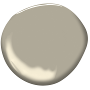
All three of the above colours will read as grey on your walls, but the first is a green-grey, the second has violet undertones and the third is a blue-grey. Which one you should use depends on the other elements in your space.
Following these guidelines will help you feel confident about the colour choices for your painting project, and allow you to get beautiful results in your home. If you feel you'd like more support, feel free to reach out to me for an e-consult-- thanks to the magic of technology I can be virtually in your living room, finding the perfect colours for you, even in this time of quarantine :-)
Until next time,
Susan
Related Posts You May Find Helpful


